TL;DR: In this tutorial, you will learn the basics of Web Components technologies and will use them to build a universal login button component. This component allows you to add Auth0 authentication to your Web application regardless of the JavaScript framework you are using. The full code of the projects built in this tutorial is available in this GitHub repository.
The Cross-Framework Components Problem
JavaScript UI frameworks and libraries like React, Angular, Vue, and others have helped developers to build awesome user interfaces for years. Their help has been not just in the look and feel of the resulting UI, but also in the technical approach to the UI construction. In fact, most of them promote a component-based approach in building Web user interfaces. Each UI element is an autonomous configurable component that can be used in different parts of the application and even across different applications.
Of course, this is a great achievement in the UI design since this component-based approach enables reusability. However, the reusability of UI components is limited to the ecosystem of each library or framework. In other words, if you create a great UI component in React, you can reuse this component in different React applications, but you cannot use it in an Angular application, and even less in an application written in pure HTML and JavaScript.
So, if you want to provide a component that can be used across multiple applications, you have to implement an instance of it for each JavaScript ecosystem. Is this the only way to build a universal component?
Web Components to the Rescue
Fortunately, there is a way to build components that works independently of the JavaScript ecosystem you are using. This way is based on Web Components, a set of standard technologies whose specifications have been available for a few years, but only recently they've been extensively supported by most browsers.
Web Components are based on three technologies:
- Custom Elements. This is a set of JavaScript APIs that allows you to create customized HTML elements.
- Shadow DOM. A set of JavaScript APIs that allows you to manage a local DOM for a component.
- HTML Template. A mechanism to define fragments of HTML markup to be rendered on-demand at runtime.
These technologies are part of the HTML living standard and are directly supported by browsers. So, you don't need any third-party libraries to use them: just HTML, CSS, and JavaScript. In this tutorial, you will learn how to use these technologies by implementing a working Web Component and by using it within React, Angular, and Vue applications.
"Learn how to create UI components that work with any JavaScript framework."
Tweet This
Building the Universal Auth0 Login Button
The Web Component you are going to build is a button that allows application users to authenticate with Auth0. The idea is to allow the developer to simply add the following markup to get a full working button that redirects the users to the Auth0 universal login page and get authenticated:
<auth0-login domain="YOUR_DOMAIN" clientid="YOUR_CLIENT_ID"></auth0-login>Since it can be used in any JavaScript application, this button simplifies the integration of the Auth0 SDK in Single Page Applications.
The Development Environment
As said before, you can create a Web Component by simply using vanilla HTML, CSS, and JavaScript. No need to build the code or to use special tools. However, to integrate your Web Component in the modern application development flow, you need to set up a Node.js development environment. So, before starting, ensure you have Node.js installed on your machine.
To start setting up the environment in which you will build and test the login button, create a folder named auth0-login-button-projects on your machine. In this folder, you will add a subfolder for each project you are going to create throughout the article.
Then move into this folder and create the first of these subfolders named auth0-login-button. This folder will contain the Web Component project you are about to create. Move into this folder and initialize a Node.js project by typing the following command:
npm init -yThis command will create a default package.json file. Edit this file and replace its content with the following:
{
  "name": "auth0-login-button",
  "version": "1.0.0",
  "description": "",
  "private": true,
  "scripts": {
    "start": "webpack-dev-server --mode development --content-base dist/ --open --hot",
    "build": "webpack --mode production",
    "test": "echo \"Error: no test specified\" && exit 0"
  },
  "keywords": [],
  "author": "",
  "license": "ISC",
  "devDependencies": {
    "webpack": "^4.41.2",
    "webpack-cli": "^3.3.10",
    "webpack-dev-server": "^3.9.0"
  }
}
This is a Webpack zero configuration project that allows you to have a minimal development environment for JavaScript applications. Once you have declared what you need in the package.json file, install the dependencies by running the following command:
npm installAfter the installation completes, create a folder named dist inside auth0-login-button and add into it an index.html file with the following content:
<!-- dist/index.html -->
<!DOCTYPE html>
<html>
  <head>
    <title>Login with Auth0</title>
    <script src="main.js"></script>
  </head>
  <body>
    <h1>Welcome!</h1>
  </body>
</html>
This HTML page will host the Web Component that you are going to create.
Defining the Custom Element
Now that you have the basic infrastructure for the project, create a folder named src in the root of the project and move into it. Here, create an index.js file with the following code:
// auth0-login-button/src/index.js

const template = document.createElement('template');

template.innerHTML = `
  <style>
  #login-button {
    background:
      #EB5424;
    color: #FFFFFF;
    text-transform: uppercase;
    border: 1px solid #EB5424;
    margin: 5px 16px 5px 16px;
    padding: 5px 16px 5px 16px;
    line-height: 32px;
    text-decoration-line: none;
    font-size: 18px;
    font-family: fakt-web, Helvetica Neue, Hevetica, sans-serif;
  }
  </style>
  <a id="login-button" href="#">Log in</a>
`;

export default class Auth0Login extends HTMLElement {
  constructor() {
    super();

    this.attachShadow({mode: "open"});
    this.shadowRoot.appendChild(template.content.cloneNode(true));
  }
}

customElements.define("auth0-login", Auth0Login);
This code defines the basic structure of your Web Component. As you can see, you create a template element and assign a block of markup to its innerHTML property. This markup contains a style element with a few CSS rules and an anchor element that represents your login button. Notice that the anchor element has the login-button identifier and that the CSS rules apply to it.
After the template definition, you have the definition of the class Auth0Login. This is the class that actually implements the custom element your Web Component is based on. Notice that it extends the HTMLElement class. This means that your component inherits all the common features of standard HTML elements. So, for example, your component will have standard properties and attributes like id, hidden, style, innerHTML, and so on. And, more important, these properties work as the user expects without any intervention on your side.
The Auth0Login class implements just its constructor, for the moment. The first line of the constructor() method invokes the base class constructor via super(). This step is very important: it allows your component to actually inherit all the features of the HTMLElement class and to be recognized as a DOM element.
The subsequent two statements create the Shadow DOM for the component. The first statement attaches the Shadow DOM to the current instance of the component and the second statement populates this DOM with a copy of the template's content. Maybe you're wondering what this is for. Here is a very brief explanation of why we are using the Shadow DOM.
A Look at the Shadow DOM
The Shadow DOM is a sort of private DOM for the component. It represents the internal structure of your component and is accessible through the shadowRoot property of the component itself. Thanks to the Shadow DOM, you avoid unwanted interferences with the global DOM. For example, you assigned the login-button value to the id attribute of the anchor representing your login button. What happens if, in the page that will host your component, there already exists an HTML element with the same id? Maybe that id is used for styling the element or to manipulate it via JavaScript. Surely, those external styles and that external JavaScript code could affect the behavior you had in mind for your component. The Shadow DOM guarantees that this cannot happen: the internal structure of your component is encapsulated and protected from external interferences.
Actually, the way you created the Shadow DOM for this component still allows the internal structure to be accessible. In fact, the {mode: "open"} object you pass to the attachShadow() method is asking to create an open Shadow DOM. This means that the users of your component can still access its internal DOM via the shadowRoot property. So, you are giving them the possibility to manipulate the structure of your component via JavaScript. If you don't want to allow this, you can pass the {mode: "closed"} object to the attachShadow() method.
The last statement in the index.js file is very important.
customElements.define("auth0-login", Auth0Login);It binds the tag name auth0-login to the class that defines your component and registers it in the collection of the custom elements available for the current HTML page. Thanks to this statement, you will be able to use the <auth0-login> tag in the markup of your HTML page.
Note: According to the Custom Elements specifications, the name of a custom element must have a dash in its name.
Dealing with Properties and Attributes
So far, you've just built the basics of the login button component. To allow the user to specify the parameters for integrating with Auth0, you need to add the domain and clientid properties to your component. These properties must be kept in sync with the corresponding attributes in the markup. So, replace the definition of the Auth0Login class with the following:
// auth0-login-button/src/index.js

//... template definition

export default class Auth0Login extends HTMLElement {
  constructor() {
    super();

    this._domain = "";
    this._clientid = "";

    this.attachShadow({ mode: "open" });
    this.shadowRoot.appendChild(template.content.cloneNode(true));
  }

  get domain() {
    return this._domain;
  }

  set domain(val) {
    this._domain = val;
    this.setAttribute("domain", val);
  }

  get clientid() {
    return this._clientid;
  }

  set clientid(val) {
    this._clientid = val;
    this.setAttribute("clientid", val);
  }

  static get observedAttributes() {
    return ["domain", "clientid"];
  }

  attributeChangedCallback(name, oldValue, newValue) {
    if (oldValue !== newValue) {
      switch (name) {
        case "domain":
          this._domain = newValue;
          break;
        case "clientid":
          this._clientid = newValue;
          break;
      }
    }
  }
}

customElements.define("auth0-login", Auth0Login, {extends: "a"});
You added the getters and setters for the domain and clientid properties. They manage their values through the _domain and _clientid internal properties. Also, the setters propagate the received values to the corresponding attributes.
In addition, you notice the observedAttributes static property that returns an array with the names of the component's attributes. This property asks the browser to be notified when the value of any of these attributes changes. You can capture these notifications from the browser by implementing the attributeChangedCallback() method. This is one of the methods, called custom element reactions, you can implement to handle some events in the lifecycle of the component.
Integrating with the Auth0 SDK
Now the user has a way to provide you the parameters to connect to Auth0. You just need to use these parameters and manage the authentication via the Auth0 SPA SDK. So, move into the auth0-login-button folder and run the following command:
npm install @auth0/auth0-spa-jsOnce the SDK is installed, you need to import it by adding the following statement at the top of the src/index.js file:
// auth0-login-button/src/index.js

import createAuth0Client from '@auth0/auth0-spa-js';

//... template definition and the other code
Now, enrich the class definition by adding a few methods to handle the authentication flow. Again, replace the Auth0Login class definition with the following code:
// auth0-login-button/src/index.js

//... template definition

export default class Auth0Login extends HTMLElement {
  constructor() {
    super();

    this._domain = "";
    this._clientid = "";

    this.attachShadow({ mode: "open" });
    this.shadowRoot.appendChild(template.content.cloneNode(true));
  }

  get domain() {
    return this._domain;
  }

  set domain(val) {
    this._domain = val;
    this.setAttribute("domain", val);
    this.buildAuth0Client();
  }

  get clientid() {
    return this._clientid;
  }

  set clientid(val) {
    this._clientid = val;
    this.setAttribute("clientid", val);
    this.buildAuth0Client();
  }

  static get observedAttributes() {
    return ["domain", "clientid"];
  }

  async attributeChangedCallback(name, oldValue, newValue) {
    if (oldValue !== newValue) {
      switch (name) {
        case "domain":
          this._domain = newValue;
          break;
        case "clientid":
          this._clientid = newValue;
          break;
      }
    }
    this.buildAuth0Client();
  }

  async connectedCallback() {
    await this.buildAuth0Client();

    this.addEventListener("click", async (e) => {
      const isAuthenticated = await this.auth0Client.isAuthenticated();

      if (!isAuthenticated) {
        await this.login();
      } else {
        await this.logout();
      }
      await this.updateUI();

      e.preventDefault();
    });

    await this.handleRedirectCallback();
    await this.updateUI();
  }

  async buildAuth0Client() {
    this.auth0Client = await createAuth0Client({
      domain: this._domain,
      client_id: this._clientid
    });
  }

  async updateUI() {
    const isAuthenticated = await this.auth0Client.isAuthenticated();
    const loginButton = this.shadowRoot.getElementById("login-button");

    if (!isAuthenticated) {
      loginButton.innerText = "Log in";
    } else {
      loginButton.innerText = "Log out";
    }
  }

  async login() {
    await this.auth0Client.loginWithRedirect({
      redirect_uri: window.location.origin
    });
  }

  async logout() {
    this.auth0Client.logout({
      returnTo: window.location.origin
    });
  }

  async handleRedirectCallback() {
    const isAuthenticated = await this.auth0Client.isAuthenticated();

    if (!isAuthenticated) {
      const query = window.location.search;
      if (query.includes("code=") && query.includes("state=")) {
        await this.auth0Client.handleRedirectCallback();
        window.history.replaceState({}, document.title, "/");
      }
    }
  }
}

customElements.define("auth0-login", Auth0Login);
The changes to the class definition can be easily identified. First, take a look at the connectedCallback() method you added to the class:
async connectedCallback() {
  await this.buildAuth0Client();

  this.addEventListener("click", async (e) => {
    const isAuthenticated = await this.auth0Client.isAuthenticated();

    if (!isAuthenticated) {
      await this.login();
    } else {
      await this.logout();
    }
    await this.updateUI();

    e.preventDefault();
  });

  await this.handleRedirectCallback();
  await this.updateUI();
}
The connectedCallback() method is another custom element reaction that is called when your component is added to the page's DOM. Its code creates an instance of the Auth0 client, adds a listener for the click event, manages the result of the authentication, and updates the UI based on the current authentication status. You will see the last two steps in more detail in a moment. If you take a look at the listener for the click event, you see that it basically gets the current authentication status of the user and calls the login() or logout() method accordingly.
These methods simply invoke the loginWithRedirect() and logout() methods of the Auth0 client, as you can see below:
async login() {
  await this.auth0Client.loginWithRedirect({
    redirect_uri: window.location.origin
  });
}

async logout() {
  this.auth0Client.logout({
    returnTo: window.location.origin
  });
}
Also, the updateUI() method displays the correct text on the login button based on the current authentication status:
async updateUI() {
  const isAuthenticated = await this.auth0Client.isAuthenticated();
  const loginButton = this.shadowRoot.getElementById("login-button");

  if (!isAuthenticated) {
    loginButton.innerText = "Log in";
  } else {
    loginButton.innerText = "Log out";
  }
}
Finally, the handleRedirectCallback() method manages the response coming from the Auth0 server after authentication:
async handleRedirectCallback() {
  const isAuthenticated = await this.auth0Client.isAuthenticated();

  if (!isAuthenticated) {
    const query = window.location.search;
    if (query.includes("code=") && query.includes("state=")) {
      await this.auth0Client.handleRedirectCallback();
      window.history.replaceState({}, document.title, "/");
    }
  }
}
You also need to rebuild the Auth0 client whenever the values of the domain and/or clientid properties change. For this reason, you invoke the buildAuth0Client() method as the last statement of their setters, as you can see:
// src/index.js

//... other code

set domain(val) {
  this._domain = val;
  this.setAttribute("domain", val);
  this.buildAuth0Client();
}

//... other code

set clientid(val) {
  this._clientid = val;
  this.setAttribute("clientid", val);
  this.buildAuth0Client();
}

//... other code
Register your App in Auth0
Now, your login button component is ready to be used. At this point, what you need to do is verify its behavior. So, open the dist/index.html page you have created before and replace its content with the following:
<!-- auth0-login-button/dist/index.html -->
<!DOCTYPE html>
<html>
  <head>
    <title>Login with Auth0</title>
    <script src="main.js"></script>
  </head>
  <body>
    <h1>Welcome!</h1>
    <auth0-login domain="YOUR_DOMAIN" clientid="YOUR_CLIENT_ID"></auth0-login>
  </body>
</html>
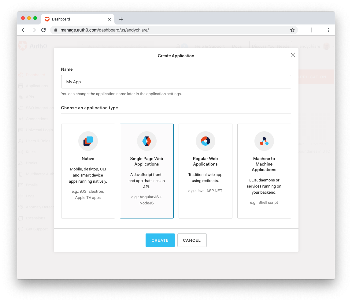
You simply added the <auth0-login> element to the page with the placeholders YOURDOMAIN and YOURCLIENTID assigned to the domain and clientid attributes. You need to replace these placeholders with the actual values from the Auth0 dashboard. So, <a href="https://auth0.com/signup" data-amp-replace="CLIENTID" data-amp-addparams="anonId=CLIENT_ID(cid-scope-cookie-fallback-name)">sign up for a free Auth0 account here</a> and, once in the dashboard, create a new application by clicking on the button Create Application.
You will get a dialog like the following:
Provide a name for the application, say Secure App, select Single Page Web Application as its application type, and click on the Create button.
Now, select the Settings tab and take note of the values of the Domain and Client ID fields. These are the values you need to replace in the markup. Then, in the same Settings tab, assign the value http://localhost:8080 for both the Allowed Callback URLs and Allowed Logout URLs fields. You are telling Auth0 that the user will be redirected to that URL after they have authenticated and after they log out of your application. Remember to save these changes in the dashboard.
Testing the Web Component
Once you've replaced the YOURDOMAIN and YOURCLIENT_ID placeholders with the actual values from Auth0 configuration, run your application by typing the following command from the root of the login button project:
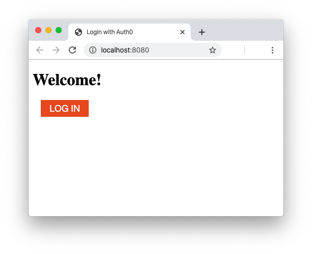
npm startYour default browser should open pointing to the http://localhost:8080/ address and you should see the following page:
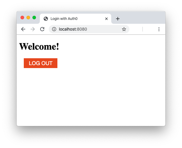
Now, by clicking on the Log in button, you should be redirected to the Auth0 universal login page. Here the user authenticates and then they're redirected again to the home page of your application. However, this time you should have a Log out button instead of the Log in button:
Awesome! Your login button component is working fine on a standard HTML page!
"Build a login button that authenticates users with Auth0 regardless of the JavaScript framework you are using."
Tweet This
Testing as an NPM Package
After this test on a standard HTML page, you would like to verify if the login button also works in Web applications built with any JavaScript framework. There are a few things you need to do before you can test this. Ideally, you'd want to build an npm package and provide it to the users of your component. The users should simply install the package and use it without worrying about source code and dependencies. After all, this is the standard way to distribute reusable code in a Node-based environment. But you don't want to actually publish your component in the npm registry. You are still developing it and you just want to test the package.
Good news! You can test your component like an npm package on your machine by using npm link.
As a first step, edit the package.json file in the root of the login button project and replace its content with the following:
{
  "name": "auth0-login-button",
  "version": "1.0.0",
  "description": "",
  "main": "src/index.js",
  "private": true,
  "scripts": {
    "start": "webpack-dev-server --mode development --content-base dist/ --open --hot",
    "build": "webpack --mode production",
    "test": "echo \"Error: no test specified\" && exit 0"
  },
  "keywords": [],
  "author": "",
  "license": "ISC",
  "devDependencies": {
    "webpack": "^4.41.2",
    "webpack-cli": "^3.3.10",
    "webpack-dev-server": "^3.9.0"
  },
  "dependencies": {
    "@auth0/auth0-spa-js": "^1.6.0"
  }
}
The only difference is the addition of the "main": "src/index.js" setting that informs npm where is the starting point of your package. Then, run the following command in a terminal window:
npm linkNote: This command requires administrative privileges, so you should use
sudoor the equivalent in your operating system.
The npm link command creates a global link to your Auth0 login button project. This link takes the name of the folder containing your project: auth0-login-button if you didn't change it.
Now, your project is ready to be consumed like an npm package by other applications in a Node-based development environment.
Integrating with React
To test the login button component in a React application, create a sample app by using create-react-app. Move into the auth0-login-button-projects folder you created at the beginning of this article and type the following command in a terminal window:
npx create-react-app secure-react-appAfter a few seconds, your application will be created in a folder named secure-react-app. Move into this folder and add the Auth0 login button dependency to the project by typing this command:
npm link 'auth0-login-button'It adds a symlink to the login button project so that you can use it like an installed npm package. So, edit the src/App.js file and replace its content with the following:
// secure-react-app/src/App.js

import React from 'react';
import logo from './logo.svg';
import './App.css';
import 'auth0-login-button';

function App() {
  return (
    <div className="App">
      <header className="App-header">
        <img src={logo} className="App-logo" alt="logo" />
        <p>
          Edit <code>src/App.js</code> and save to reload.
        </p>
        <a
          className="App-link"
          href="https://reactjs.org"
          target="_blank"
          rel="noopener noreferrer"
        >
          Learn React
        </a>
        <auth0-login domain="YOUR_DOMAIN" clientid="YOUR_CLIENT_ID"></auth0-login>
      </header>
    </div>
  );
}

export default App;
You imported the auth0-login-button module and added the <auth0-login> element in the JSX code that will be rendered for the App component. Now, replace the placeholders with the actual values you got before from Auth0.
Since by default the React application built with create-react-app is published at the http://localhost:3000/ address, you must add this URL as an Allowed Callback URL and an Allowed Logout URL in the Auth0 dashboard.
Finally, you can run your React app by typing the following command:
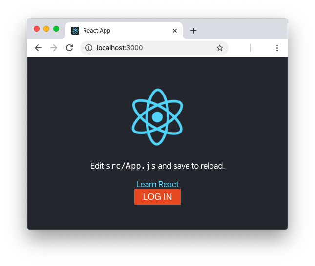
npm startNow, your browser should show the following:
As for the standard HTML page, if you click the Log in button you are redirected to the Auth0 universal login page. After the authentication, you will come back to this page and find the Log out button.
Integrating with Angular
Now, try to test your login component also in an Angular application. As a first step, install Angular CLI, if you don't have it already installed, with the following command:
npm install -g @angular/cliNote: This command requires administrative privileges, so you should use
sudoor the equivalent in your operating system.
Then, again, move into the auth0-login-button-projects folder and type the following command to create a very basic Angular app:
ng new secure-angular-app --minimal --routing=false --style=cssAfter the application is created, move in the secure-angular-app folder. Here, add the Auth0 login button dependency to the project by running the following command:
npm link 'auth0-login-button'Since the Auth0 login button component is written in JavaScript, you should add the "allowJs": true setting as a TypeScript compiler option in the tsconfig.json configuration file. Your tsconfig.json file should look like the following:
{
  "compileOnSave": false,
  "compilerOptions": {
    "allowJs": true,
    "baseUrl": "./",
    ...
  },
  "angularCompilerOptions": {
    ...
  }
}
Now, you need to enable custom elements. Otherwise, Angular will attempt to interpret any non-standard HTML element as an Angular component, throwing an error. To enable custom elements, open the src/app/app.module.ts file and replace its content with the following:
// secure-angular-app/src/app/app.module.ts

import { BrowserModule } from '@angular/platform-browser';
import { NgModule, CUSTOM_ELEMENTS_SCHEMA } from '@angular/core';

import { AppComponent } from './app.component';

@NgModule({
  declarations: [
    AppComponent
  ],
  imports: [
    BrowserModule
  ],
  schemas: [CUSTOM_ELEMENTS_SCHEMA],
  providers: [],
  bootstrap: [AppComponent]
})
export class AppModule { }
You are importing the CUSTOM_ELEMENTS_SCHEMA module and configuring it as the reference schema for the application. Now, add the Auth0 login button in the src/app/app.component.ts file. The new code should look like the following:
// secure-angular-app/src/app/app.component.ts

import { Component } from '@angular/core';
import 'auth0-login-button';

@Component({
  selector: 'app-root',
  template: `
    <!--The content below is only a placeholder and can be replaced.-->
    <div style="text-align:center" class="content">
      <h1>
        Welcome to {{title}}!
      </h1>
      <span style="display: block">{{ title }} app is running!</span>
      <img width="300" alt="Angular Logo" src="data:image/svg+xml;base64,PHN2ZyB4bWxucz0iaHR0cDovL3d3dy53My5vcmcvMjAwMC9zdmciIHZpZXdCb3g9IjAgMCAyNTAgMjUwIj4KICAgIDxwYXRoIGZpbGw9IiNERDAwMzEiIGQ9Ik0xMjUgMzBMMzEuOSA2My4ybDE0LjIgMTIzLjFMMTI1IDIzMGw3OC45LTQzLjcgMTQuMi0xMjMuMXoiIC8+CiAgICA8cGF0aCBmaWxsPSIjQzMwMDJGIiBkPSJNMTI1IDMwdjIyLjItLjFWMjMwbDc4LjktNDMuNyAxNC4yLTEyMy4xTDEyNSAzMHoiIC8+CiAgICA8cGF0aCAgZmlsbD0iI0ZGRkZGRiIgZD0iTTEyNSA1Mi4xTDY2LjggMTgyLjZoMjEuN2wxMS43LTI5LjJoNDkuNGwxMS43IDI5LjJIMTgzTDEyNSA1Mi4xem0xNyA4My4zaC0zNGwxNy00MC45IDE3IDQwLjl6IiAvPgogIDwvc3ZnPg=="/>
      <auth0-login domain="YOUR_DOMAIN" clientid="YOUR_CLIENT_ID"></auth0-login>
    </div>
    <h2>Here are some links to help you start: </h2>
    <ul>
      <li>
        <h2><a target="_blank" rel="noopener" href="https://angular.io/tutorial">Tour of Heroes</a></h2>
      </li>
      <li>
        <h2><a target="_blank" rel="noopener" href="https://angular.io/cli">CLI Documentation</a></h2>
      </li>
      <li>
        <h2><a target="_blank" rel="noopener" href="https://blog.angular.io/">Angular blog</a></h2>
      </li>
    </ul>

  `,
  styles: []
})
export class AppComponent {
  title = 'secure-angular-app';
}
As usual, replace the YOURDOMAIN and YOURCLIENT_ID placeholders with the actual values from Auth0. Also, add the http://localhost:4200/ URL as an Allowed Callback URL and an Allowed Logout URL in the Auth0 dashboard. Now you are ready to start the Angular application with the following command:
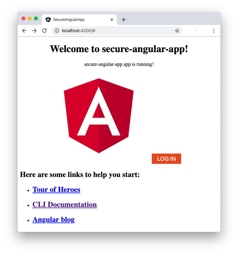
ng serveThe standard basic Angular application will be shown with a Log in button, as in the following picture:
Again, you should have the same login experience as per the standard HTML page and React application.
Integrating with Vue
To complete your tests, integrate the Auth0 login button with Vue. If you don't have Vue CLI already installed, install it with the following command:
npm install -g @vue/cliNote: This command requires administrative privileges, so you should use
sudoor the equivalent in your operating system.
As in previous cases, move into the auth0-login-button-projects folder and type the following command in a terminal window to create a minimal Vue app:
vue create secure-vue-app --defaultAfter a few seconds, your application will be created in the secure-vue-app folder. Move into that folder and add the Auth0 login button dependency by typing the following command:
npm link 'auth0-login-button'Similarly to the Angular case, Vue would attempt to consider non-standard elements like Vue components. So, you need to tell it which elements to ignore. To do this, open the src/main.js file and replace its content with the following:
// secure-vue-app/src/main.js

import Vue from 'vue'
import App from './App.vue'

Vue.config.productionTip = false

Vue.config.ignoredElements=[
  'auth0-login'
  ]

new Vue({
  render: h => h(App),
}).$mount('#app')
As you can see, you added the auth0-login tag name in the list of the ignored elements.
Now, open the src/App.vue component and replace the content of the script section with the following code:
// secure-vue-app/src/App.vue
//... template section
<script>
import HelloWorld from './components/HelloWorld.vue'
import 'auth0-login-button'
export default {
  name: 'app',
  components: {
    HelloWorld
  }
}
</script>
//... style section
The difference with the previous version is the import of the Auth0 login button module.
Now, in the same file, replace the template section with the following:
// secure-vue-app/src/App.vue
<template>
  <div id="app">
    <img alt="Vue logo" src="./assets/logo.png"/>
    <auth0-login domain="YOUR_DOMAIN" clientid="YOUR_CLIENT_ID"></auth0-login>
    <HelloWorld msg="Welcome to Your Vue.js App"/>
  </div>
</template>
// ... script section
// ... style section
You added the <auth0-login> element to the markup of the Vue component. As in the previous tests, remember to replace the placeholders with the Auth0 parameters. You shouldn't need to add any new URL in the Auth0 dashboard since the Vue development web server listens on http://localhost:8080, a value that you already registered.
Before launching the Vue app, you need to create a vue.config.js file in the root of the project with the following code:
module.exports = {
  chainWebpack: config => config.resolve.symlinks(false)
}
This should avoid an issue due to the interaction between HMR and symlinks, as documented here.
Finally, you can run your Vue app by typing the following command:
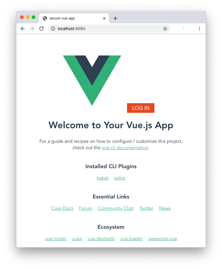
npm run serveYour browser will present the following screen and, as usual, you will be able to log in via Auth0:
"Authenticate users in React, Angular, and Vue applications by using the same login button component."
Tweet This
Summary
In this tutorial, you learned what Web Components are and which standard technologies are behind them. You used these technologies to build a login button component that allows users to authenticate with Auth0. After completing the component, you learned that it can be used across applications built with different JavaScript frameworks. In fact, beyond using it in a standard HTML page, you seamlessly used it in a React app, an Angular app, and a Vue app.
You can find the full source code of the projects created throughout this tutorial in this GitHub repository.


