Overview
We're going to analyze data that contain cases flagged as abnormal. So we'll build a predictive model in order to spot cases that are not currently flagged as abnormal, but behaving like ones that are.
Topics are:
- Creating a predictive model (random forest)
- Introduction to ROC value (model performance)
- Understanding of label and score prediction
- Inspection of suspicious cases (audit)
- Prediction and dimension reduction (t-SNE)
Let's start!
This post contains R code and some machine learning explanations, which can be extrapolated to other languages such as Python. The idea is to create a case study giving the reader the opportunity to recreate results. You will need the following:
- Download R engine
- Download RStudio IDE
Note: There are some points oversimplified in the analysis, but hopefully you'll become curious to learn more about this topic, in case you've never done a project like this.
First, install and load the packages (libraries) containing the functions we'll use in this project, and load the data.
# delete these installation lines after 1st run
install.packages("caret")
install.packages("funModeling")
install.packages("Rtsne")library(caret)
library(funModeling)
library(Rtsne)
## download data from github, if you have any problem go directly to github: https://github.com/auth0/machine-learning-post-2-abnormal-behavior
url_git_data = "https://raw.github.com/auth0/machine-learning-post-2-abnormal-behavior/master/data_abnormal.txt"
download.file(url_git_data,"data_abnormal.txt")
## reading source data
data=read.delim("data_abnormal.txt", header = T, stringsAsFactors = F, sep = "\t")The data contains the following columns:
colnames(data)## [1] "id" "abnormal" "var_1" "var_2" "var_3" "var_4"
## [7] "var_5" "var_6" "var_7" "var_8"We are going to predict column abnormal based on var_1, var_2 ... var_8 variables.
Inspecting target variable:
freq(data, "abnormal")Almost 3 percent of cases are flagged as abnormal.
Next, we create the predictive model using Random Forest, doing the model parameter tuning with caret library using 4-fold cross-validation optimized for the ROC metric. We'll come back to this later.
You can find the basics of random forest in the first post of this series.
################################################
## MODEL CREATION:
################################################
set.seed(999)
## Setting the validation metric: Cross-Validation 4-fold.
fitControl = trainControl(method = "cv",
                           number = 4,
                           classProbs = TRUE,
                           summaryFunction = twoClassSummary)

## Creating the model, given the cross-validation method.
fit_model = train(abnormal ~ var_1 + var_2 + var_3 + var_4 + var_5 + var_6 + var_7 + var_8,
                 data = data,
                 method = "rf",
                 trControl = fitControl,
                 verbose = FALSE,
                 metric = "ROC")
There are some important things to note about the last layout:
The mtry column indicates a parameter that is optimized by the library caret.
The selection is based on the ROC metric. This metric goes from 0.5 to 1 and indicates how well the model distiguishes between True Positve and False Positive rates. The higher the better.
Choosing the "best" model
Predictive models have some parameters that can be tuned in order to improve predictions based on the input data. In the last example, caret chooses the best model configuration based on a desired accuracy metric---ROC, in this case.
Random forest does not have many parameters to tune compared with other similar gradient boosting machines. The parameter to tune was mtry.
caret tested 3 different values of mtry, and the value which maximizes the ROC value is 6.
Cross-validating results is really important; you can get more information in ref. [1]
What is the ROC value?
This is a long -long- topic, but here we try to introduce you to some aspects to start becoming familiar with it.
Some history
During World War II, radar detected if an airplane was coming or not, so they sent out the following alerts:
Hey, a plane was spotted!(positive prediction)Be easy, no plane is coming....(negative prediction)
These outcomes can be True or False, so we have four possibilites:
1- If the detection of Hey, a plane was spotted! is True, it is called a True Positive.
2- On the other hand, if Hey, a plane was spotted! is False, the result is a False Positive, which implies that the radar (predictive model) said a plane was coming but there isn't actually a plane out there.
3- The radar says Be easy, no plane is coming.... and the real result is Positive: It's a True Negative.
4- The radar says Be easy, no plane is coming.... and the real result is Negative: It's a False Negative.
Abnormal example data
In the data we used to build the model, we have:
Positiveis when abnormal=yes.Negativeis when abnormal=no.
Normally we associate the positive value with the less representative value, which is the one we are trying to explain and the least common.
Analysis of possibilites
Points 1 and 3 imply the radar (or the predictive model) asserts the prediction.
With points 2 and 4, the model failed---it predicted one thing and it was actually the opposite.
The ROC value measures the trade-off between the True Positive and True Negative rates. This is because we need to be sure about what the model is saying when it detects a Positive outcome:
Is this Positive prediction reliable or not?
Usage in medicine
This accuracy metric is so powerful that it is used in other fields, such as medicine, to measure the accuracy of certain diagnoses:
"The flu test for this patient was positive": if this result is confirmed after a while or a second test, we've got a true positve.
It is used in many tests in which the result is either true or false; it's very important to know if we can trust this result.
Usage in Auth0
We did some proof of concept to automatically spot the most suspicious login cases in order to boost current anomaly detection feature, and ROC curve was a good option to test the predictive model sensitivity.
More info about current anomaly detection feature at ref. [2]
Understanding the extremes
Knowing extreme ROC values is a good approach to better understanding it:
- An ROC value of
1indicates all thePositivevalues returned by the model are correct. Perfect model. - An ROC value of
0.5indicates all thePositivevalues returned by the model have results similar to random guessing. This is the worst model.
See more about ROC in ref. [3]
Going back to the predictive model
We talked about the predictive model output, which is something like: positive / negative or yes / no. But it's better to work with probabilities (also known as score) so the output of any predictive model (in binary or multi-label class prediction) should be the score.
For a longer explanation, see ref. [4].
Once we get the score value, we can select all cases above a threshold and label them as abnormal.
We assign the probability of being abnormal=yes to each case:
data$score=predict(fit_model$finalModel, type="prob")[,2]We can kept with those cases with are actually abnormal=no:
# filtering cases...
data_no_abnormal=subset(data, abnormal=="no")
We obtain the top 2% of cases with the highest score for being abnormal:
# obtaining the score to filter top 2%
cutoff=quantile(data_no_abnormal$score, probs = c(0.98))

# filtering most suspicious cases
data_to_inspect=subset(data_no_abnormal, score>cutoff)
And here we've got in data_to_inspect ~ 60 cases which are actually no abnormal, but they are showing a behavior of being suspicious.
Displaying only the first 6 suspicious IDs to further inspect...
head(data_to_inspect$id)## [1] 59 94 105 107 224 259Is there a way to visualize how the predictive model "sees" data and assigns the probabilities?
Let's talk about projections
We've built a machine learning model in order to know the abnormal cases, using random forest.
Predictive models handle several variables at the same time, which is different from the classical reporting approach, in which you see two or three variables in one plot.
In the following example, you'll see how eight variables are mapped in only two dimensions. In this case there are eight, but it could be thousands. This is quite fancy since it is like a compression of the information.
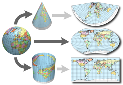
You've probably already seen this "complex" technique: in geographical maps. They map three dimensions into two:
There are several ways to do this with data; the most popular is probably Principal Component Analysis -aka PCA- (however, this doesn't lead to good visualizations). The one we used in this post is t-Distributed Stochastic Neighbor Embedding, which is also implemented in languages other than R. More info at ref. [5].
Google did a live demo based on text data, see ref. [6].
Hands on R!
First some data preparation--excluding id and score variables to create the t-SNE model. Also, converting all string variables into numeric ones since t-SNE doesn't support this type of variable (one-hot encoding or placeholder variables).
Actually, we're going to map 17 variables (not eight) because of this transformation.
# excluding id column and score variable
data_2=data[,!(names(data) %in% c("id", "score"))]
d_dummy = dummyVars(" ~ .", data = data_2)
data_tsne = data.frame(predict(d_dummy, newdata = data))
Now we create the t-SNE model, adding it to the score variable we created before.
set.seed(999)
tsne_model = Rtsne(as.matrix(data_tsne), check_duplicates=FALSE, pca=TRUE, perplexity=30, theta=0.5, dims=2)
d_tsne = as.data.frame(tsne_model$Y)
d_tsne$abnormal = as.factor(data$abnormal)
d_tsne$score=data$score
d_tsne = d_tsne[order(d_tsne$abnormal),]
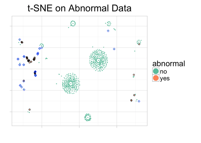
Now the magic! Plotting the resulting t-SNE model which maps 17 variables in two dimensions :)
ggplot(d_tsne, aes(x=V1, y=V2, color=abnormal)) +
  geom_point(size=0.25) +
  guides(colour=guide_legend(override.aes=list(size=6))) +
  xlab("") + ylab("") +
  ggtitle("t-SNE on Abnormal Data") +
  theme_light(base_size=20) +
  theme(axis.text.x=element_blank(),
        axis.text.y=element_blank()) +
  geom_point(data=d_tsne[d_tsne$abnormal=="yes",], color="black", alpha=1,shape=21) +
  geom_point(data=d_tsne[d_tsne$abnormal=="no" & d_tsne$score>=cutoff,], color="blue", alpha=0.8,shape=5, aes(color=Class)) +
  scale_colour_brewer(palette = "Set2")
But what are we seeing there? Analysis
Blue rhomboids represent the cases which are actually not flagged as abnormal, but are flagged as "highly abnormal" by the predictive model (this is what was analyzed before).
Pink points represent the cases which are actually flagged as abnormal.
Green points are the cases which are not actually abnormal, having a low likelihood of being one of them.
Similar cases tend to be closer in the plot.
Pink cases are close to the blue ones. These are the cases predicted as highly suspicious and that share similar behavior with the ones actually flagged as abnormal.
That's why we left the score variable out of the t-SNE model creation. This model put closely together some cases that were actually abnormal and not abrnormal, and this makes sense since these cases were flagged by the random forest as suspicious ones.
Look at the biggest islands made of green points---there are no abnormal points, flagged or predicted, near them.
Conclusions
The cases flagged as abnormal, plus the top 2 percent of suspicious ones detected by the random forest, are mapped closer together away from the normal cases, because they behave differently. This is one way of uncovering the information in the data.
Time to play with your own data :)
References
- [1] Why validate predictive models? Knowing the error
- [2] Anomaly detection feature at Auth0.
- [3] Wikipedia ROC Curve
- [4]
Data Science Live Book - Data Scoring
- [5] Original implementation t-Distributed Stochastic Neighbor Embedding
- [6] Open sourcing the Embedding Projector: a tool for visualizing high dimensional data
to clone from Github (only R code).
Are you building a product that takes advantage of machine learning? We at Auth0, can help you focus on what matters the most to you, the special features of your product. Auth0 can help you make your product secure with state-of-the-art features like passwordless, breached password surveillance, and multifactor authentication. We offer a generous free tier to get started with modern authentication.


