Even large successful companies like Facebook understand and utilize the power of A/B testing to ensure they stay ahead. A/B testing is a powerful tool you can use to drive more conversions from your site.
The main goal of an A/B test is to test two or more variants of a page to determine which option works best. Starting your tests high-level before moving to test smaller details is the best way to maximize these conversions.
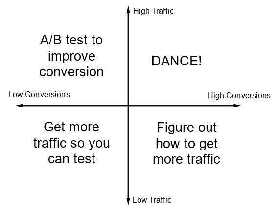
It's important to make sure you choose a page that has high traffic but low conversions so that you're maximizing returns. If conversions are high but traffic low, then you need to find a way to drive more traffic which isn't something you can A/B test for. Low conversions and low traffic also won't benefit from an A/B test because without any traffic to gather data from, your A/B test won't have results.
"Choose a page that has high traffic but low conversions, so that you're maximizing returns."
Tweet This
Source: Unbounce
A/B testing one change at a time allows you to fully determine the effect of that variation. This way, you can combine the effects of multiple changes over time to optimize for the best page possible. But most people take this to mean they should A/B test minor changes to their site. Here we are going to show you why that thinking is wrong, and how big A/B tests allow you to get great data while making great changes to your site.
The Problems With Starting Small
When deciding how to conduct A/B tests, Facebook knows to start big picture to have the biggest impact before even thinking about the smaller details.
As we've mentioned, one of the most important A/B testing rules is to test only one thing at a time. This way you'll make sure it's something that counts, rather than trying out multiple little things.
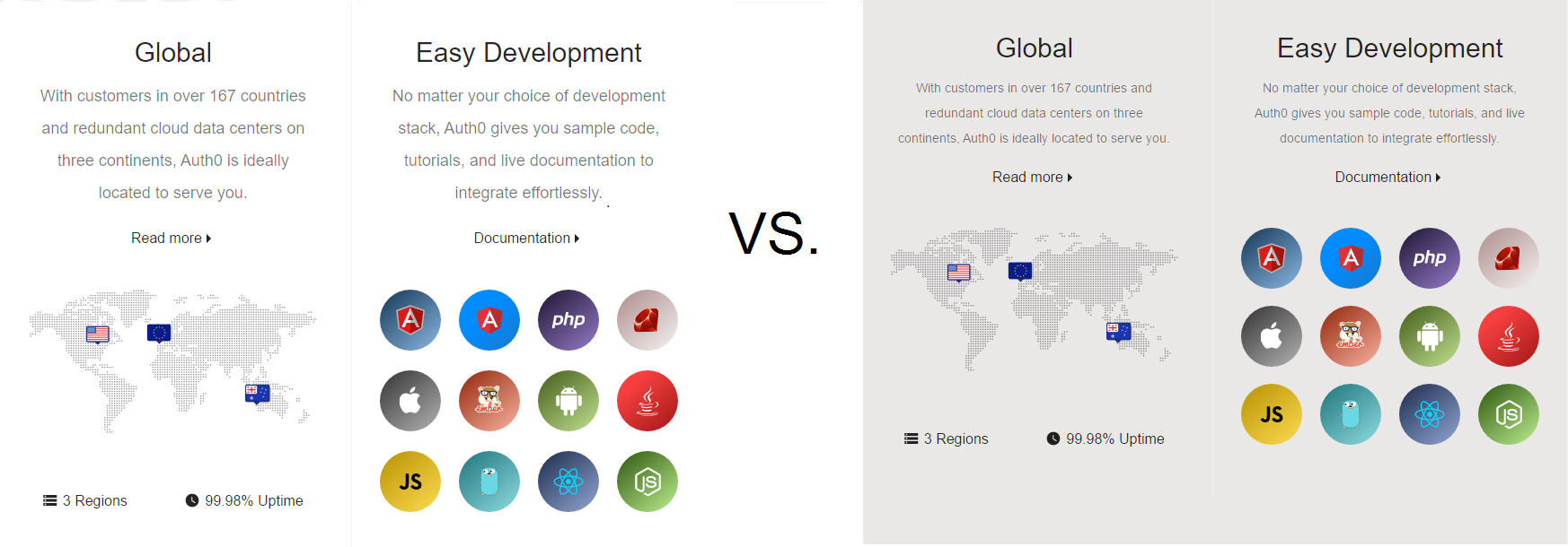
The other problem with testing multiple small things like colors, small text, or call-to-action is that you can't be entirely sure what is really making a difference if at all. You're likely not making much of an impact. Conversion rates may be changed by a percent of a percent at most, if there is even enough traffic to make a statistically significant comparison.
For example, if we made the above changes — slight color and font resize — to the Auth0 homepage, it likely wouldn't make a difference. In fact, most people probably wouldn't even notice that we made a change. It certainly wouldn't effect the number of conversions.
When looking to A/B test, it's better to make big changes first to have the most significant effect. Small changes are good for optimizing further down the road, but those first need to be guided by larger-scale tests.
Go Big, Then Go Small
Starting big will ensure that your A/B test will “create results, not statistics” by focusing on the message you're trying to present, rather than the words you use to do so.
There are countless examples of impressive A/B testing case studies available online, but even in this compilation of “10 kickass A/B testing case studies,” the ones that made the biggest changes saw the biggest improvements. Testing the things that have the biggest impact — such as headlines, graphics related to sales or product description — will present the biggest returns.
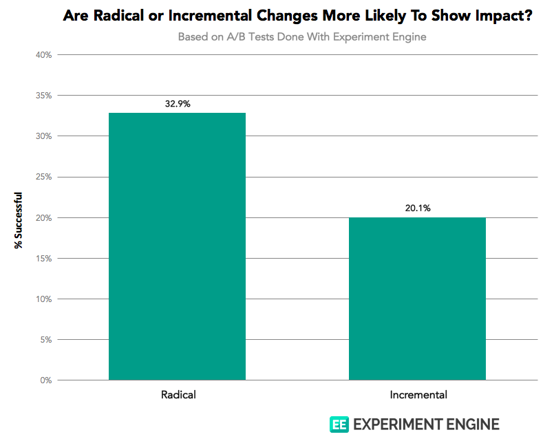
Companies should also not be afraid to make radical changes to test a completely new idea. As shown in a study done by conversion optimization platform Experiment Engine, radical changes are more likely to show impact. With more general idea testing, if the change doesn't work, it is easy to just not launch rather than having to re-do your entire page for a small change that proved unsuccessful.
How This Works For Any Industry
In any industry, starting high-level and testing the entire landing page can open many doors for things to A/B test further down the line. Making big changes can reveal surprising and maybe even unintuitive results that you might've never expected.
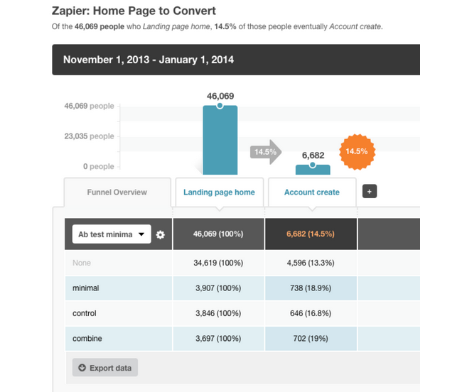
For web app automation service Zapier, completely changing their landing page gave them the boost they needed. Though they received criticism for having a simplistic landing page, this choice was actually a result of a surprising A/B test.
They had compared the two above landing pages, thinking that the more informative page would lead to more conversions. Instead, they discovered that the simplistic page ended up leading to statistically significant more converted signups and active users than the other.
Zapier isn't the only company to make big changes to their web page to find out what appeals most to users.
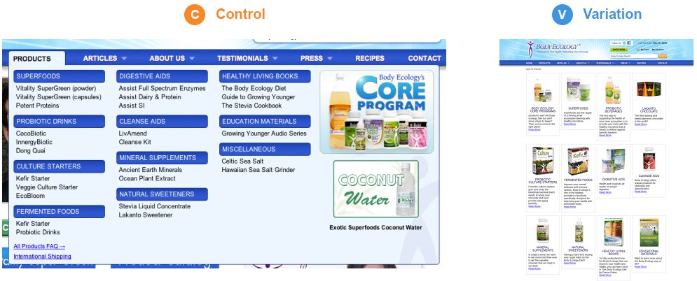
Health-related eCommerce store Body Ecology added product categories to their homepage instead of a drop-down menu, increasing revenue by 56.43%.
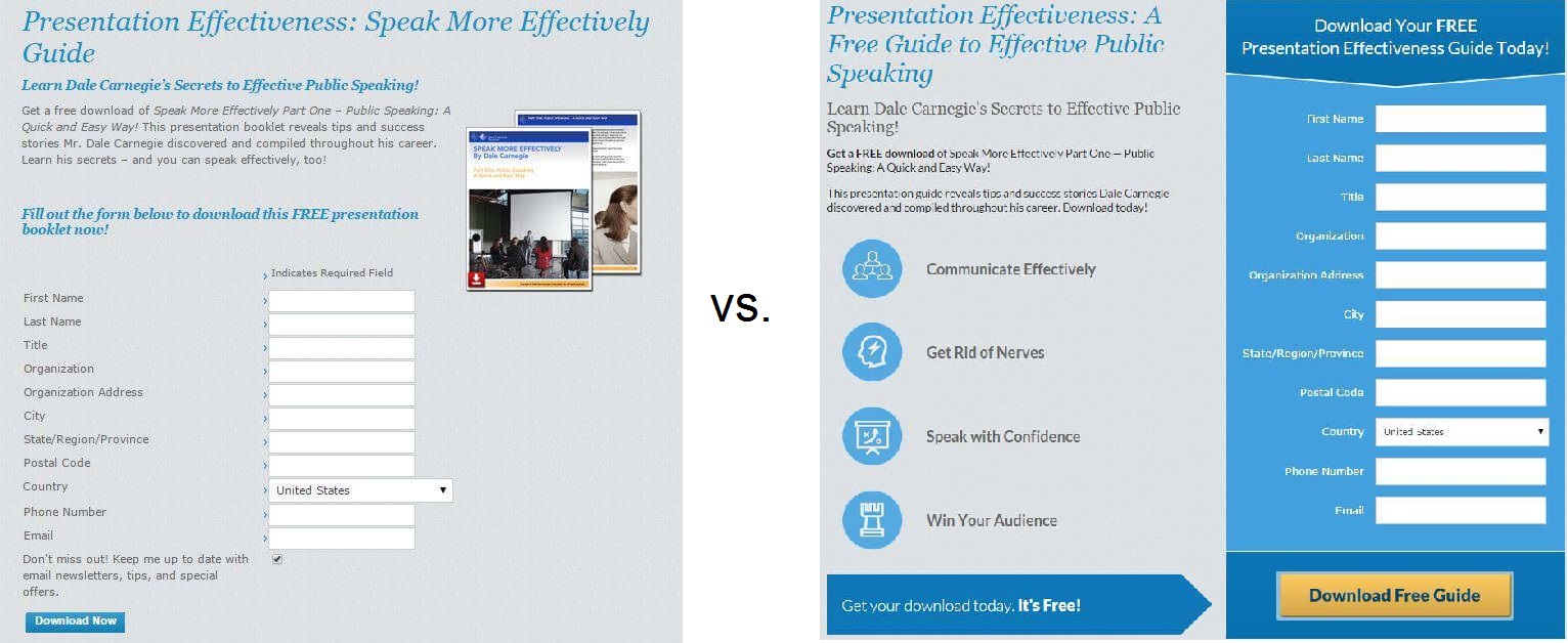
Business training company Dale Carnegie redesigned their main lead generation page to more clearly display the benefits of their course in a 2-column design. This change led to a 17.1% increase in downloads.
Spreadshirt, where people sell their T-shirt ideas online, increased conversions by 606% by simplifying the “how to” section of their website.
By improving their value proposition and emphasizing a free new town, The Sims 3 increased visitor registration by 128%.
By making entirely new pages and A/B testing more general ideas, these companies were able to see a more immediate difference that they could then start to iterate and optimize.
How To Run An A/B Test
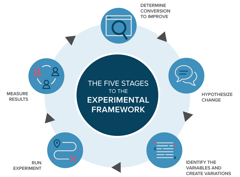
There is a scientific process you can follow when running A/B test experiments:
- Conduct background research: Use data from analytics to provide insight on what to test.
- Determine your goal: Know what you're working towards and never test without a goal in mind.
- Construct a hypothesis: Identify and prioritize reasons on why you think this variation will be more effective.
- Prepare your experiment: Make the changes! Using a software platform can make creating these variations much easier.
- Run your experiment: Run the A/B test. Make sure your visitors are split evenly and interactions with your site are measured accurately.
- Analyze your results: Use the data collected to see if there was a statistically significant difference and determine how to move forward.
This process, similar to the experimental framework from A/B Testing and Personalization Platform Optimizely, is very general and can be applied to any A/B testing situation.
Following this process will make sure you are testing with a purpose and will learn something from the results, regardless of success.
A/B Test Everything — But Start With The Big Things
Starting your A/B tests high-level will give you the biggest returns quickly. By incorporating each successful change into the next A/B test, you will compound on these benefits to your conversions even more.
And the best part? If the change doesn't give the result you want, you can simply not launch the new page. Even if you get bad results, by testing, at least you know what doesn't work.
"If the change doesn't give the result you want, you can simply not launch the new page."
Tweet This
The main takeaway message is that you are free to test anything on your website, so it's best to start big. You may learn that something you never expected is what appeals most to your customers.


